
COMMUNICATING THE GOOD NEWS
In This Issue
December 2022
FEATURED ARTICLES
AT-A-GLANCE
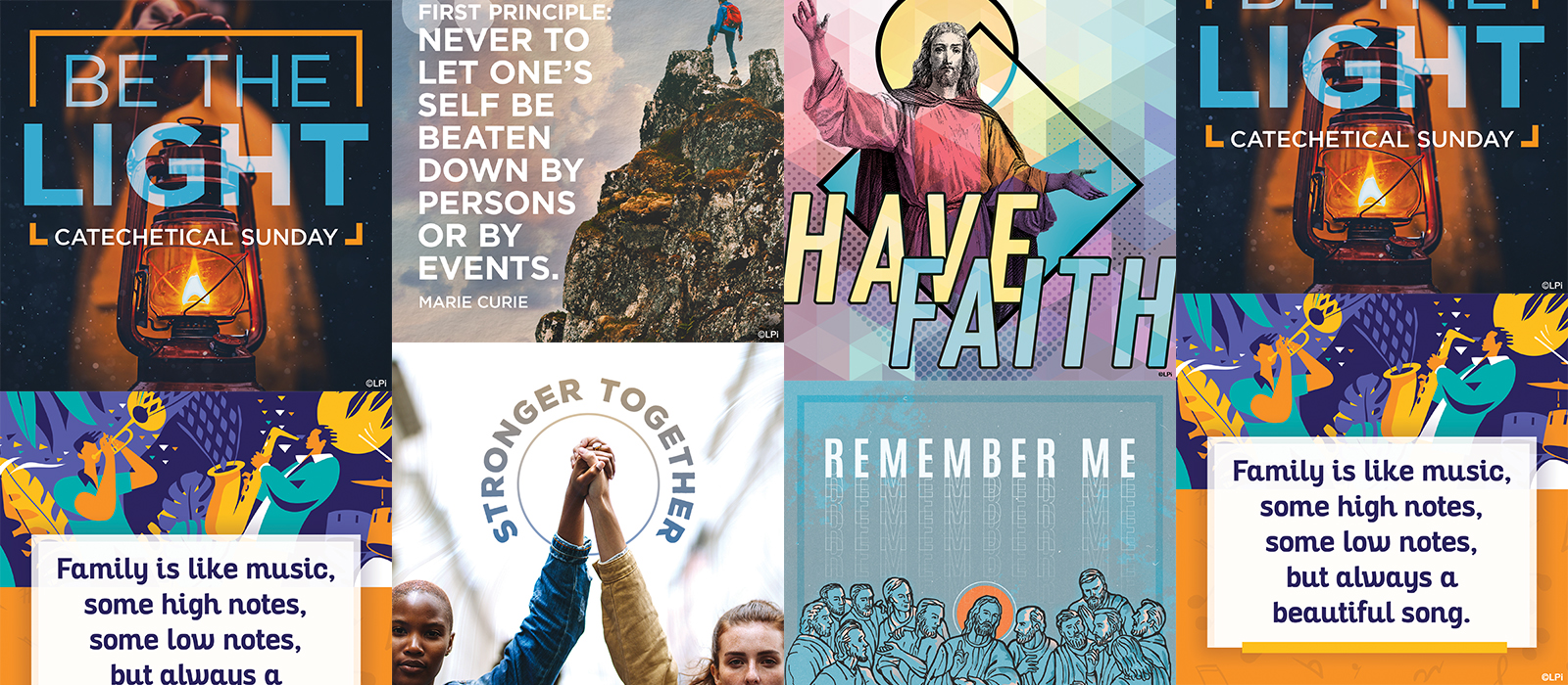
Church Graphics Our Designers Loved Making
Did you know that there is an entire team of graphic designers behind the thousands of graphics, designs, templates, and more that we release every year? These images are created for you to use in your bulletins, websites, social media posts, flyers, (and any other way you can think of) through our WeCreate collection!
We asked our designers to share about the pieces they most enjoyed making over this past year, collected their responses and examples of the work, and compiled them here so you could get a little behind-the-scenes view of who your LPi design team is and a taste of the passion that they put into their art!

Heidi —
This is one of my favorites of the year because the message is important to me. I wanted to create an image that had as much impact as the message does.

Heidi —
I love the lighting of this piece, and the contrast of the geometric shapes with the organic background is really visually interesting.

Heidi —
I’m a big fan of how the overlaying textures and subtle colors turned out in this piece. Sometimes it can be hard to balance text and a strong image because they end up competing instead of working together in a hierarchy, but I think everything balances really well here.

David —
This one was very different than anything we’ve done previously for our Connect! Sunday Reflection blog, so I had fun, took a risk and I think it paid off! It’s vibrant, modern, geometric, and has a playful energy. My goal was to get people excited when they saw this piece! Have fun and have faith!

Gaby —
One thing I absolutely love about graphic design is that you often have the freedom to be either very literal with a piece or more abstract in its interpretation. This was one of those very literal pieces that I have done, where the imagery I chose directly correlates to the text. I think that is why the piece turned out so successfully, because by marrying the two elements you give the audience that connection as well. If you’ll notice too, the imagery I chose is rather dark which in turn makes the idea of “light” that much more impactful in the piece, you truly get that feeling of light shining through in the darkness.

Gaby —
Overall, the Gospel meditation companion pieces are one of my favorite sections of artwork we designers do on a month-to-month basis. I love being able to focus on typography and photography that is more “people-driven” in its nature. This piece is special to me because by focusing on a single person as the subject with nothing in the background you can really start to put yourself into the piece and say, “yes, God loves me” even if you don’t look exactly like that person, the piece implies itself to everyone who is viewing it! I also always try and challenge myself to play with text in every piece I create, how can I change the size of the text, turn it on its side, flip it, etc. I think by stacking the text in this piece on top of each other as well as having part of it be just an outline, it allows for you to see that each line of text holds its own importance, but together the message is even stronger.

Gaby —
With a lot of my work, I tend to look for inspiration before I even start designing. That often gives me a better sense of the direction of where I want the piece to go, and what feeling I want the piece to give viewers. This idea was inspired by a piece I saw on a catholic design blog called Sunday Social. I was in complete awe of the design and thought to myself, “How can I introduce some of the techniques/styles they are using into our LPi artwork?” This clip’s translation says, “You are priest forever,” so I was thinking about how I could visually show this idea of “forever.” I chose this image of a man cropped within a circular shape, but his arm is breaking out of the bounds of the circle. This is to show that there is something outside of the circle or outside of this “life” that extends forever. Then by adding some depth and feel to the piece with different color tones and textures, I was able to bring the design to life and allow it to tell its story.

Tim —
Fall is easily my favorite season. To convey the seasonal change in this piece I focused on color, specifically a warm pastel palette. I love the cozy feeling you get from this.

Erich —
The concept for this piece was mainly inspired by the first half of the quote, "Never to let one’s self be beaten down..." I chose an image which would portray someone overcoming something that would be very difficult, the rough rock, unstable ground and the higher elevation. While choosing the image I was looking for one where I could replace the sky background in order to create more of a unique image and have an open space for the quote yet still convey the heights that the person has climbed. The composition is visually balanced yet asymmetrical, which allows for dynamic movement as the typography and mountain shape mirror each other. Overall, I enjoyed this creating this piece of art because the quote speaks to something I hold very true to myself, to not let yourself be influenced by the negativity/judgement or other people or situations, to always be true to who you are.

Erich —
I chose this piece because of the unique typographic solution I was able to achieve in a narrow space while maintaining the emphasis and readability of both words and the overall idea of the art. The image is simplistic yet very emotionally recognizable allowing the viewer will instantly connect with the message conveyed by the art.

Kristen —
“Do this in remembrance of me.” Luke 22:19 Last Supper, Communion imagery. I love this art graphic in particular for the more modern approach to such an iconic statement and imagery of the Last Supper painted by Leonardo da Vinci. Simplifying the focus with the colors to show Jesus with a opposite color halo and then having each disciple's face reflect that light. This ended up being one of my favorite things about this graphic.

Kristen —
“Go out and make disciples of all nations.” Everyone is called to be a witness. In this image, created for social media use, I wanted to speak more to a crowd who don’t necessarily think they identify as the “typical witness” in a modern design approach with colors you would find associated with the Holy Spirit and Pentecost Sunday.

Kristen —
A Good Friday message, God’s plan for us was his Son, this social media banner focus solely on the message of “Unfailing Love” in a modern design. Each of my favorite pieces that I have designed this year speaks to that more modern aesthetic. I connect more with messages in that style, and I think younger parishioners connect to it as well. While I do design Catholic pieces in other styles this modern approach is what resonates with me.
If you want access to all of these graphics along with the thousands of others we have available, make sure you are subscribed to our WeCreate library. If LPi already prints your bulletin you are already subscribed! Our customer support team is always ready to assist you so if you need help accessing these tools you can contact them here! We always love when people share with us their favorite pieces, so, if you have a favorite LPi graphic please share about it in the comments so we can pass on your praise to our design team!

EDITOR FEATURE
Hey all! You've seen a lot of changes to this newsletter in the past year. What tweaks and topics would you like to see in 2023? We'd love your two cents!

Church Branding for Beginners
Our teams meet with churches all over the United States. Did you know that many of the churches we meet with don’t have a unique brand for their parish!?
We hear it all the time — “We need to reengage our youth and get them back into Church!” and “We want to make our church a place that attracts more young families.” When our design team asks parishes what their goals are, one of the answers is inevitably, “We want people to know that we are a welcoming community,” or “We want strangers to feel comfortable here.”
Now, imagine that you and your family JUST moved to a new town. You’re looking for a great restaurant to make into the weekly family brunch spot and your neighbors keep recommending a place called Grandma’s Kitchen. What’s the first thing you’re going to do? You’re going to pull out your phone and look up directions to the diner as well as look for information about it online. If the logo you see for Grandma’s Kitchen looks outdated, if the menu looks like it was typed up and printed in 1995, or if their website is lacking clearly delivered information and is outdated looking, you will likely skip the place and keep looking. THE EXACT SAME CONCEPT applies to church communities! If your branding is outdated or unprofessional looking, visitors will skip your parish and move on with their search. Do we have your attention? Good. Let’s talk about church branding.
What is Branding Anyway?
Branding commonly refers to the distinctive design your church uses to display, promote, and advertise yourselves. Your brand is present everywhere and on everything your church has a hand in. This doesn’t just mean a church logo! Branding includes a logo, fonts, specific colors, and can even include specific ways that you present these things. All of these items should be collected into a “brand book” or, in your church’s case, let’s call it a “brand bible!” Where should these elements of your parish’s brand bible be frequently found?
For a cohesive look and feel that is consistent across all your parish communications, your branding should be found in:
- Your letterhead
- Your website(s)
- Envelopes
- Newsletters
- Holiday and special event cards
- Social media profiles
- Posters
- vBanners
- Email signatures
- Church swag like magnets, mugs, and t-shirts
- Lawn signs
- Special event programs
- Business cards
- Brochures
- And more!
How Can I Tell If Our Branding Needs Help?
Use this checklist to see if it’s time for a refresh — if you check anything on this list, it’s time!
- If you can’t really pinpoint if you even have a logo or if you notice that what would be considered your church’s logo or branding looks dissimilar on different items. For instance, the name of your church at the top of your bulletin looks a lot different from the sign out in front of your property or the logo on your church’s Facebook profile photo.
- Your brand was created way before your church even had a website or used email or, if you haven’t had a branding refresh in the last decade.
- Your community has grown and changed, and you find that your branding doesn’t reflect your current vibrant parish community.
- You are merging with another parish and need to help the communities come together with a fresh look.
- Your parish recently recovered from a natural disaster or other tragedy, and you need a fresh look to help everyone move forward into a fresh start.
- Your parish recently decided to open or close a parish school and needs branding to reflect this change.
- You poll your parishioners, and they say that the brand needs to be … updated.
How Do I Improve Our Branding?
First, find a designer who is skilled in creating brandings for churches. They should know about logos, fonts, color pallets, and be able to incorporate your unique parish community into the design! We have a team dedicated to this at LPi that you can contact here!
Next, consider thinking about the following questions before meeting with your designer. Having the answers to these questions already fresh in your mind can enhance your meeting experience and ensure you don’t miss anything important to your community when you are helping the designer plan a branding for you!
- Is there something unique about your church that you want reflected in the brand?
- What are some of your parish’s strengths?
- What are some descriptive words that describe your parish?
- Are there any existing brand elements like colors, fonts, logos, or icons that need to be included in the design?
- Do you have a mission statement that could be reflected in the design?
- Is there anything about your church’s history or traditions that might be important to include?
Lastly, consider who will be deciding on the final branding design. Often, designers will provide a few options to choose from after meeting with you. At LPi, our designers commonly give churches 3 or 4 designs to deliberate over! Will you be polling your parishioners to rate their top choices? Is it up to the parish leadership team to decide? Is the pastor the one making the last call? Whoever it is, make sure they have ample time to decide as well as all of the information about the new brand and what information went in to creating it.
Check out our Facebook page to see frequent posts about how proud we are of the branding redesigns we are doing for other churches! There are also a plethora of samples of complete branding packages we’ve done on our website. Like what you see? Jump start your rebranding process and contact us today using the form below! You could have your very own fresh brand, style guide, and branding bible before you know it!

Take Your Church Flyer Game Higher
Have you ever heard the phrase “work smarter, not harder”? When it comes to church events, having a work smarter goal can save you some major headaches over the course of your event planning and execution. We all know that having professional looking flyers and advertisements for your event or program is essential to people attending or signing up, but let’s be realistic — how many graphic designers do you actually have on your church staff to make them? If your answer is NONE then, this blog is for you! We’ll outline a few best practices, give you some examples, and share about a template tool that can save you loads and loads of time!
Too Many Words!
The single worst thing anyone can do when trying to design an effective flyer is to put way too much information on it. Remember, a flyer is not a brochure. Flyers are not meant to share every single little piece of information about a program or an event. All of your event’s little details can be outlined in a program, webpage, or brochure that your flyer ultimately directs people to. The purpose of a flyer is to grab a person’s attention, create interest, and invite a call to action. That call to action might be to register, visit a website to learn more information about something, pick up a brochure/program, or to simply show up! Before creating your flyer, ask yourself what the most basic important information is that needs to be communicated.
The specifics that are most likely needed on your flyer include your event’s:
- Location
- Date
- Time
- Cost
- What’s Included in the price
- Who the event is for/Who is invited
- Contact Information
- Cutoff date for registration or RSVPs
- QR code to a web page with more info or instructions on how to learn more
Information that you may be tempted to include but should probably be put in a web page or brochure instead includes:
- Full event schedules
- Menus
- Speaker/Presenter Bios
- Arrival or location instructions
- Letter-like event descriptions. For example, something like —
“Join us for our winter dance fundraiser where everyone can have a lot of fun and raise money for the Covington Food Bank”
should, instead, simply say —
“Winter Dance” with “A benefit for the Covington Food Bank” on the line below.
The Psychology Behind Good Design
Did you know that our brains are wired to be attracted to some types of designs and repelled by others? Some tips that will attract people to your flyer design are:
- Use a larger font!
Using a font that is too small can cause people to actually look away from your flyer due to the image being way too busy. Our eyes seek out big, bold images and when words on a flyer are too small and too many, people often won’t even try to read them. - Give things space!
Don’t try to squeeze too much information in your flyer by smushing everything together on the page. Busy images with little space to let the eye rest can actually cause people anxiety and create an environment where they actively look away from the flyer to avoid the mess of images and words instead of being drawn into it. - Use intentional colors!
Using too many colors or colors that don’t go well together can create the same type of anxiety for the viewer as using too many objects or words can. Did you know that it used to be a common practice in fast food restaurants to color the walls with multicolored wallpaper and mix all of the primary colors together inside their restaurants because the psychological effect of the constant bombardment of many different colors was that people would feel uncomfortable and would eat and then leave the restaurant more quickly? This way the fast-food chain keeps things moving fast! This is the opposite of what you want to be doing with your flyers, so, choose 2 or 3 complimentary colors and stick with those! Don’t go overboard! - Remember that hierarchy matters!
The most important elements should be seen first so they will be the largest, and boldest. It wouldn’t make sense to have the time and cost be the largest part of a flyer — instead, the name of the event and any information that might hook the viewer should be your focal point.
Our Best Time-Saver Tip
Let’s give you a major leap forward into the “work smarter” arena and introduce you to the LPi ready-made flyer template tool. WeCreate, our ever-expanding collection of thousands of graphics, stock photos, and design templates, provides subscribers professionally designed downloadable content for your church’s print and digital projects! In WeCreate we have a collection of flyer templates made by our design team that you can very simply customize and use for your own events! New designs added every month. Want a sample? We selected a few of these flyer designs to offer to you, on our free Catholic art page.
If you use one of our flyer templates for an upcoming event, we’d love to see it! Tag us on Facebook when you post it for your community so we can see the great work you are doing!

Using the Facebook and Instagram STORIES Tool for Engagement
An awesome tool that both Facebook and Instagram have developed over the last few years is their STORY feature. This tool is so robust and a great (free!) way to engage with your community when used correctly. In this blog you will find some tips and tricks on how to utilize the social media story feature to share your own vibrant parish community with the world!
Stories? Why should I have to learn ONE MORE THING?
Social media is an extension of the wonderful community that your church has already built and, simply put, the way that the majority of your parishioners are communicating with each other in their daily lives. Did you know that 82% of people in the United States use Facebook to communicate with each other on a daily basis? Since this is the case, churches should consider using all of the tools that Facebook and other social media platforms offer in order to connect daily with their community and keep their community connected!
The story feature on Facebook and Instagram is designed specifically to encourage your following to message you and engage with each story post you make. Story posts expire after 24 hours and are usually quick and sweet while also incorporating easy to use tools for engagement. For this reason, using the stories feature makes it easier for you to engage with your followers on a daily basis! Stories are also a quick and easy way for you to collaborate with followers and repost their content — another tool you can use to engage with your community and lift up your parishioners!
So, What Exactly ARE Social Media Stories?
On Facebook and Instagram, a story is a post you can make that consists of either a photo or a short video. These posts work like a slide show and offer a new photo or video after a few seconds. Story posts show up in your STORIES FEED instead of on your regular ol’ newsfeed. Stories expire in 24 hours, so this feed is constantly refreshing. This is appealing to your users because they know that they should look at your stories if they want to find quick, current content from you. This attraction is evident in the fact that most posts using the stories feature get many times more views and interactions than newsfeed posts do. This is due to the allure of quick, current content, as well as the fact that Facebook provides more access points for users to view your stories than it does to your permanent newsfeed.
Why does Facebook prefer to promote story posts over regular newsfeed posts? In part it’s because story posts have a bunch of options for INTERACTIVE features that you can add to your photo or video which keep people using the app for longer amounts of time. These features are how you can direct more engagement with stories, and Facebook is ALL ABOUT getting as much engagement as possible.
Engagement tools you can add to story posts:
- Captions for accessibility for all users!
- viewer polls
- donation buttons
- question and answer prompts
- quizzes
- products to buy
- links
- music
- Countdowns
- Food orders
- Small business support shout outs
- mentions & tags
All responses to a story post will go to the app’s messaging feature as a direct message to you instead of being posted as a comment or a “like” as is standard on newsfeed posts. You can then message the user who interacted with your story, “like” whatever they sent via messenger, or use the engagement data collected from that story post. For example, if you are doing a poll and you get poll results, you could put those results in a new story post for even more engagement! Engagement, engagement, engagement!
What Kind of Content Should I Be Posting in Stories?
It’s this author’s opinion that all regular newsfeed posts should also be mirrored in your stories as story posts. Remember, more eyes are usually on stories than on newsfeed posts so one way to draw attention to a new newsfeed post is to also post it as a story!
Need help getting started? You’re in luck! In WeCreate, LPi’s digital library of ready-to-use content made specifically for you, there’s an entire selectin of images created specifically to be used in social media stories.
In WeCreate, these images can all be found under the section titled "Social Media Stories.” If you click that section and then use the search bar, the words you search will only turn up results that are sized and designed specifically to be used as Facebook and/or Instagram stories. Often these images are grouped in WeCreate with other images that are visually similar to them so that you can use them, one after the other, for multiple story slides! Basically, we made it really easy for you to just take our ready-made images and create in-depth stories for your church in the blink of an eye! You can simply save them from WeCreate and then drop them into whatever platform you are using — or if you are feeling fancy, you can overlay one of the special engagement tools (mentioned earlier in this blog) onto them.
Remember that for maximum viewership, it’s important to make sure that the privacy settings on your stories are set to public. This way, anyone who visits your church’s Facebook or Instagram can view them and interact with you!
The All-Important Story Highlight Menu
For Instagram users, your stories don’t actually have to have a 24-hour expiration date. To avoid this, make sure to build a library of your most important story posts by using Instagram’s Story Highlights tool. When you highlight a story, you are effectively building a catalogue of story content that you want to save permanently on your Instagram feed. You can separate these permanent story posts into categories of your choosing like news, milestones, staff introductions, polls, parishioner highlights, or whatever else you can come up with. This library of story content will show up as part of your Instagram profile and viewers will see these category options for story highlights before they even see your main newsfeed!
Conclusion — Tag us!
Want to connect with us? Tag LPi in your stories! Tagging another user in your story post makes it possible for that user to easily re-post your story into their own story feed! This is a great way to promote each other online by sharing content so, if you use our WeCreate story resources, feel free to tag us and maybe you will find your story reposted on our own social media accounts! On Facebook we are @LitPub and on Instagram we are @LPi_Community. See you in the social sphere!

Introducing Father John Muir
LPi is pleased to present a new writer for our weekly Gospel Meditations available in WeCreate starting this Advent season — Fr. John Muir, pastor of St. Thomas Aquinas Parish in Avondale, Arizona. Fr. Muir is a published author and speaker in the Catholic community. To introduce him to you, we interviewed him about his life and his parish family. Here’s what he had to say!
1. Describe your parish demographic in 280 characters or less.
St. Thomas Aquinas parish has over 5500 registered families, made up of a variety of ages, ethnic and cultural backgrounds, and economic status. Filipinos, Hispanics, Polish, Nigerians, Ugandans, Tanzanians, Italians, Irish, and many more. It’s a joyful, faith-filled place.
2. Why do most people visit your city?
Near us, the Phoenix International Raceway has two big races each year. The Wigwam Resort attracts many people to our area, as do several golf courses. The White Tank mountains are popular for hiking.
3. What do people say when they visit your parish for the first time?
“Wow, it’s so big! It’s so beautiful! It’s so colorful.”
4. What is a fun fact about you?
Although I live in Phoenix, deep down, I’m a Vermonter. This means I love maple syrup, Ben & Jerry’s ice cream, and believe in lake monsters.
5. Which communication platforms do you use to spread the message of Jesus to the world?
I have a side project called Catholic Breakfast, which is a website as well as a social media space. It’s my attempt to engage, encourage, and equip people who are “Catholic curious” or just getting started in the faith. It’s available at CatholicBreakfast.com.
6. What is an unexpected blessing of your priesthood?
The friendships and relationships that form when I am living my life on mission. I’m amazed at how deep and meaningful friendships are with so many priests and lay people. That’s a huge joy.
7. You’re writing our new Gospel Meditations, what end-goal encouraged you to agree to this project?
I want Catholics to know and love the Bible! The Bible is breathtaking in its power to illuminate and change us for the better. The more I can facilitate this for others, the better. Writing the Gospel Meditations is a blessing for me too because it helps me be more attentive to the Scriptures, which never disappoint.
8. Do you have a favorite Gospel-writer?
I have a special affection for Saint Luke because he clearly learned a great deal about the Lord Jesus from the lips of Mary, herself. Also, I love the way he records three persons breaking into song near the time of Jesus’ birth — Zechariah, Mary, and Simeon. He appreciates the connection between Christ and art from the very beginning. He understands that the love of Christ makes us sing.
9. What is one of the scariest invitations God has extended to you and how did you respond?
Last year I was invited to give the opening invocation for a NASCAR race. It was broadcast on live television. I was pretty nervous because I wasn’t sure how the largely Protestant crowd would respond to a Catholic priest. Also, it was on live TV. No second chances. But, as I waited to start, I realized that God had sent me there and the Sacrament of Holy Orders would give me whatever I needed. When the cameras came on and it was my turn to speak, I spoke confidently and calmly. It went so well. As I left the race that night, many folks said to me with their southern drawl, “Nice work up there, Father!”
10. What advice for the spiritual life have you received that has made a difference in your life?
Just try to please Jesus. Do everything for him, and don’t worry what anyone else thinks. Everything else will take care of itself.
Churches who print their bulletins with LPi have full access to WeCreate for free! If you don’t publish with us, reach out to us to get started. You can also purchase a subscription to WeCreate here.
ALSO FROM LPi
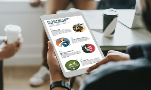
FREE Social Media Ideas
Social media offers a great way to communicate with your parishioners. We’ve collected some post ideas for you in this custom infographic!

Branding Matters
A good brand invites parishioners and seekers into the mission of your church, helping everyone to grow in faith, live in hope, and reach out in the love of Jesus Christ.
Join Our Team!
Social media offers a great way to communicate with your parishioners. Not sure what to post? We’ve collected some ideas for you!
Become a Bulletin Customer
Spend less time worrying about your church printing and more time transforming your community for Christ.
In This Issue
December 2022
FEATURED ARTICLES
- Church Graphics
- Editor Feature
- Church Branding for Beginners
- Take Your Church Flyer Game Higher
- Introducing Father John Muir
ALSO FROM LPi
More resources
- DIGITAL CATHOLIC ART & CONTENT FOR EVERY WEEK
With WeCreate, you’ll find the latest in stock photography, church clip art, Catholic prayers, weekly Gospel reflections, and more to make your communications engaging and vibrant.
Learn more - HOW TO TAKE MASS ATTENDANCE IN A PANDEMIC
Discover how the Archdiocese of St. Louis showed that just because church doors were closed, didn’t necessarily mean the faith community was inaccessible.
Click here to learn more. - THE STEWARDSHIP OF THE GOOD SAMARITAN
”Are you and I required to respond to the daily call of Jesus Christ? No. True stewardship requires nothing of us because true stewardship is all about giving of oneself freely. ”
Click here to read more.