
COMMUNICATING THE GOOD NEWS
In This Issue
August 2022
FEATURED ARTICLES
- Does Anyone Read Printed Materials Anymore?
- Tips for Printing in Color: CMYK vs. RGB
- Graphics that GRAB: Designers Talk Cover Art
- Parish Dispatch
AT-A-GLANCE
Does Anyone Read Printed Materials Anymore?
You may have heard the claim that print media has gone the way of the dinosaur. Clickbait article headlines love to spotlight statistics about diminishing returns for newspapers, shrinking publishing practices, and the average consumer’s dwindling attention span.
But before you plan for a paperless future at your parish, remember that’s only half the story.
Sure, digital content is surging to prominence in every medium, from newspapers and books to church bulletins. And while your parish is likely — and rightly — putting a high priority on effective digital communication, don’t make the mistake of forgetting about printed materials entirely.
Think of the apostles and the gift of the Holy Spirit that enabled them to communicate with different populations. In that same way, parishes must be able to communicate the same message across all platforms, digital and print alike.
When it comes to ministry, the question of print vs. digital isn’t an either/or dilemma — it’s a both/and solution. Here are four reasons that print remains an integral component of your parish communication plan, even while you prioritize digital outreach.
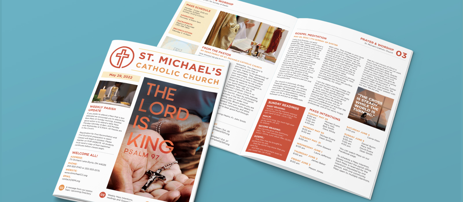
The bulletin is an institution.
LPi’s research shows that 97% of Catholic parish bulletins are taken home every week, while 85% of parishioners report hanging on to old issues. The Catholic parish bulletin is more than just a flyer or a handout — it’s an institution! It’s a relationship you can hold in your hands, pin to your bulletin board, dive into in the morning coffee line and even save for posterity. It is less easily ignored, skimmed, discarded or “clicked off of” than its digital counterpart.
Print reaches your demographics.
Your methods of communication have to be as varied as the backgrounds and circumstances of your parishioners. Forgetting about the potential of print communication can essentially mean forgetting about a large demographic of church-going adults. While millennials, Gen Z, and even Gen X are smartphone-savvy and accustomed to consuming digital publications, studies show that younger generations favor reading printed learning materials and trust print publications more than digital media. Their grandparents who grew up without digital landscapes, also appreciate the longevity and reliability of a print piece.
Print still has power.
Even though digital avenues of advertising are increasing in popularity, print hasn’t given up the hold it has on our collective consciousness. Research shows that print advertising is associated with stronger consumer retention and action, and when it comes to reading books, the preference for print is much stronger than the preference for digital.
Digital can only do so much.
We all came to understand a strange paradox during the era of livestreaming Mass at the pandemic’s onset: digital relationships can connect people who are separated by a thousand miles, but they are not able to truly bring them together. After all, there is a reason we must be present in-person to receive the sacraments. There is a reason that gathering in community for the sacrifice of the Mass is preferable to watching it on television. There is a certain sacredness to the physical that is reflected by print media in a way that digital media alone cannot replicate.
If you’re ready to save time and money with a combined solution for your print and digital communications, then it’s time to check out LPi’s ePub Design.

EDITOR FEATURE
Hey everyone!
I’m Danielle, part of the team that brings you this monthly e-newsletter. To better hear your story, we’ve started including a short prompt for you each month about your best practices and tips for ministry!
For example, last month we asked about what kind of images you select for the cover of your church bulletin. Here’s a little of what we learned:
- A church in Danville, Vermont uses pictures of their altar “decorated for different occasions.”
- Another church in Miami, Florida says they focus on “colorful depictions of Christ. This year I concentrated on featuring depictions of the Lord on all bulletin covers.”
We appreciate your responses to last month’s inquiries because they helped guide us as we leaned into ways that you can improve your church’s print experience in this month’s newsletter.
Here’s what we’re curious to hear from you about this month:
- Are you doing something snazzy with your website? If so, we’d love to hear about it!
- What content do you believe is most important for a parish to include on their homepage?
We’re looking forward to hearing from you,
Danielle

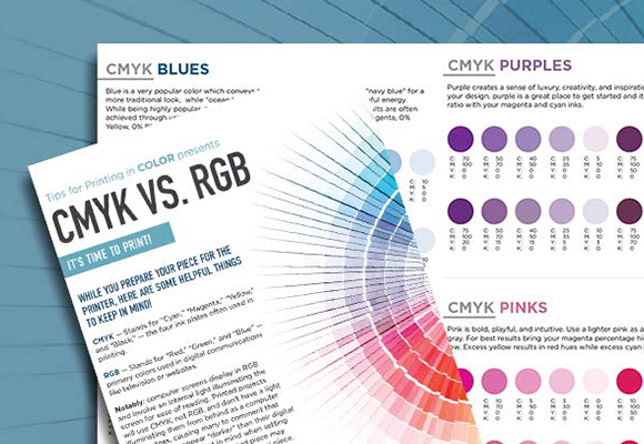
Tips for Printing in Color: CMYK vs. RGB
As you prepare your piece for the printer, here are some helpful things to keep in mind!
CMYK — Stands for “Cyan,” “Magenta,” “Yellow,” and “Black,” — the four ink plates often used in printing.
RGB — Stands for “Red,” “Green,” and “Blue” — primary colors used in digital communications like television or websites.
Notably: computer screens display in RGB and involve an internal light illuminating the screen for ease of reading. Printed projects will use CMYK, not RGB, and don’t have a light illuminating them from behind as a computer screen does, causing many to comment that printed pieces appear “darker” than their digital counterparts. Keep that in mind when setting up a print project — your printed piece may appear slightly darker than your digital piece. Adjust accordingly for best results.
When printing CMYK, each ink color is assigned a percentage on a 100-point scale. For example, for a pure red, the printer selects: 0% Cyan, 99% Magenta, 100% Yellow, and 0% Black.
Not sure of your percentages? Here are some tips for ways to achieve success in coloration!
CMYK BLACK
Black and 85% Black make great accent secondary colors to a bright feature color, and convey a strong, modern design.
Black is one of the CMYK colors, so the density of the hue will depend on the percentage of black ink used. A blend of all the CMYK colors can be used to result in a “rich” black, or more saturated color. Be careful when adding black to other colors — an attempt to use black to darken other colors can often make them muddy.
CMYK REDS
Red is best used for a traditional, strong look, it pairs well with oranges and golds for a warmer, energetic style. Red can communicate warmth and passion, but it also can be overwhelming if used too heavily. Reds are a finicky bunch when it comes to printing — sometimes appearing orange or rusty upon print. If you find that your red is too pink, your magenta level is too high. If you see too much orange, yellow is too high.
CMYK ORANGES AND BROWNS
Orange can be great way to show a cheerful, enthusiastic, youthful style when paired with bright light blues and teals. To achieve a bright orange, use two parts yellow, one part magenta. Orange can command attention without being overpowering.
Brown is a neutral and earthy look that conveys reliability and warmth. Brown brings a sense of wholesomeness to designs. Our recommendation is to use different shades of brown, think “tan,” or “russet,” or “caramel.” Brown is similar to orange — a blending 2 parts yellow, one part magenta is the starting point, but the amount of cyan added begins to direct the color in a brown direction.
CMYK YELLOWS AND GREENS
Yellow is often considered positive, optimistic, and energetic. Yellow is one of the CYMK inks — use more magenta to make it more golden.
Green appears on the “cool” spectrum of color, and it is considered a calm and peaceful color. Green is often associated with growth, rebirth, nature, stability, endurance, and abundance. It is often related to wealth, as well. Mixing cyan and yellow results in green. For vibrant greens, mix cyan and yellow equally.
CMYK BLUES
Blue is a very popular color which conveys trust, loyalty, and peace. Use a “navy blue” for a more traditional look, while “ocean blue” introduces a more modern, peaceful energy.
While being highly popular, it is difficult to accurately produce. The best results are often achieved through using even and balanced mixtures (i.e. 100% Cyan, 50% Magenta, 0% Yellow, 0% Black).
CMYK PURPLES
Purple creates a sense of luxury, creativity, and inspiration. If you are looking to change up your design, purple is a great place to get started and it is an unexpected choice. Try a 3:2 ratio with your magenta and cyan inks.
CMYK PINKS
Pink is bold, playful, and intuitive. Use a lighter pink as an accent color to a navy blue and gray. For best results bring your magenta percentage high and your yellow, cyan, and black low. Excess yellow results in red hues while excess cyan leads to purples.
CMYK GOLDS AND SILVERS
Metallics are neutral. They give a refined elegance that conveys confidence and prestige. Use these tones with a burgundy, berry red. A true metallic isn’t possible on a standard CMYK printer like the ones used at LPi — metallics require specialized equipment with either Pantone spot inks or foils.
CMYK BRIGHT COLORS
On the lookout for the most vibrant rendition of colors possible? Without the backlighting of a computer screen, a printed page will never produce hues as brilliantly as a digital display, but color mixes that will pop are usually deeply saturated with at least one of the CMYK colors at 100%.

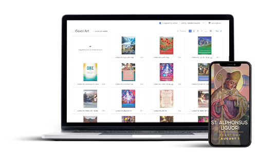
Graphics that GRAB — Designers Talk Cover Art
LPi’s Design Team produces Catholic art and content for a variety of parishes and preferences, providing graphics that correspond to Sunday messages and Liturgical seasons. One service that the team offers is art that can be used on bulletin covers. To appeal to a wide audience, the team provides six options for cover art each week, each with a different theme or style. Looking for new ideas for bulletin art but not sure where to start? Take a few tips from these designers!
Traditional
The Traditional series starts with the Sunday Gospel. From there, the team searches for classic art that directly represents the Gospel story — Mary and Martha, the Woman at the Well, the Feeding of the Five thousand, etc. Expect paintings from the masters of the High Renaissance — dramatically lit scenes, deep colors, striking compositions. The image will be layered with text from the Gospel message, pulling out a verse or two that captures the highlight of the story.
From the Designers…
Gabriella: Traditional art on a cover feels comfortable and familiar for your audience.
Evan: When using traditional pieces people know exactly what to expect week in and week out, it’s a very straight-forward experience for your congregation.
Heidi: This design style is very clean and to-the-point while maintaining classic aspects that people love and admire.
Contemporary
Maybe you’ve done the whole painting-from-the-Renaissance route and you’re looking for something fresh and updated. Faced with this dilemma, the design team’s solution was a text-forward option they have titled “Contemporary.” This minimalist cover features subtle colors and geometric shapes playing in the background: sun rays, dots, and unique color pairings. A single word from Sunday’s scripture holds a place of prominence, with the verse containing that word in smaller type below.
From the Designers…
Gabriella: (This is her top pick of the cover series.) It is a diverse, versatile series, focused on typography, that can be used in any bulletin or social post and appeal to a wide audience range — both the younger and more established crowd. If you’re looking for something cohesive across a few months, a series like this is the way to go.
Evan: In this style of art, we are using a word as the focus instead of an image. If a church is using a design with a lot of other information — Mass times, staff names, etc. — a simplified, clean graphic like a word treatment makes a lot of sense.
Heidi: This is a more simplistic choice, graphically. It is an excellent solution if there are other busy parts of your bulletin cover — masthead, logo, or other places.
Vibrant
If “Traditional” is your classic oil painting and “Contemporary” is your clean and modern word-treatment, the design style that the designers call “Vibrant” is a middle-ground between the two, recently redesigned by Heidi. This art style looks for bold and bright art depictions of the Gospel story that are a little less recognizable, think a stained-glass image of St. Paul’s conversion vs. the iconic piece by Titian. The pieces are still designed with corresponding verses of the Bible displayed below.
From the Designers…
Heidi: This is a creative piece that’s going to catch your eye, it’s artistic with painterly elements. We’ve noticed that some communities are drawn to bold, colorful pieces. When creating this piece, we keep things bright and captivating.
Evan: For churches that want something a little bolder and more colorful, art that adds texture and vibrance while still maintaining traditional depictions is a good solution.
Psalm
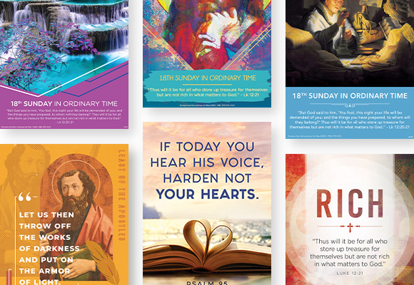
Every Mass features a short phrase, repeated verbally by the congregation, the Psalm response. The Psalms are meaningful songs, composed thousands of years ago, but relevant and striking as ever. These short phrases have been explored by the design team and made into art pieces for a visual accompaniment to the Sunday Liturgy.
This series is Evan’s favorite, a photography-forward design overlaid with text which makes the responsorial Psalm visually appealing. Conceptually, exploring the Psalms opens a whole new world of options.
From the Designers…
Evan: The Psalm series reaches a new audience but is respectful to faith tradition. It’s successful because it has a modern media feel for a younger demographic but can still include folks who have been at the church for 50 years. Since the photography we use is always changing, the design seems fresh week-to-week.
Nature
God reveals Himself through truth, goodness, and beauty, and the designers created a nature series to lean into beauty with stunning seasonal photos of beautiful parts of creation. They pick a photo with a beautiful piece of nature and overlay with a verse from Sunday’s Gospel in a modern design with a bold color-choice.
From the Designers…
Gabriella: My favorite part of the nature series is the simplicity and cleanliness of the design. it’s image-heavy, focused on landscapes with different natural features.
Heidi: It’s modern, minimal, and it focuses on the beauty of the world.
Saint
Long-term LPi followers might be familiar with a piece made after beloved Catholic saints. In this series, photographs of modern life were overlaid with a quote from a beloved saint, all in a subtle monochrome color treatment. BUT WAIT! That series will experience an update in the coming year! Beginning with the First Sunday of Advent, this series will still feature a quote from an inspiring Catholic hero.
From the Designers…
Gabriella: Our new design is a fresh, new take on what defines traditional artwork and what that can look like.
Evan: The imagery is comfortable for a church audience, but in a modern format.
Heidi: A modern take on collage — stay tuned!
(A sneak peak of this new series is hidden in the collage of covers at the top of this article!)
We love designing beautiful art for churches across the United States. Want a free 90-Day trial to WeCreate to view the bulletin covers explained here? Fill out the form at the bottom of this page.
We can’t wait to see what you create!

Father Tom Lucas S.J., St. Ignatius Loyola Parish, Sacramento, CA
We are so honored to work with vibrant parishes across the United States, each one working to bring the Kingdom of God to their neighborhoods. In the Diocese of Sacramento, Father Tom Lucas serves at St. Ignatius Loyola Parish in Sacramento. Here he answers some questions about his special parish. (Answers have been edited for length).
Q. Describe your parish demographic in 140 characters or less.
A. Suburban, mixed ethnicity but mostly white, well established (1954), well educated, some pockets of poverty.
Q. What makes your community unique?
A. We get people from all over the Sacramento Metro Area and beyond who like the kind of ministry we do, solid preaching, care for our neighbors, positive progressive spirit. Lots of alumni from Jesuit schools around the country as well.
Q. Why do most people visit your city?
A. It’s the state capital, and a good place to raise families. Don’t come in the middle of the summer, it’s an oven. A dry oven, but still an oven.
Q. What do people say when they visit your parish for the first time?
A. They like the warmth and hospitality we try to share.
Q. Where (and what) do you recommend for your best local eats?
A. Don Javi’s Taco Truck, and Falad’s Falafel Truck, both in the parking lot of the thrift store next door to the church. They come to all our parish picnics too. The Waffle House two doors down is also a favorite.
Q. What is the last film you saw that you would recommend to your parishioners?
A. I’m not a big movie goer, but returning to Sacramento where I grew up, I often recommend Lady Bird, a heartfelt coming-of-age film inspired by the girls’ catholic high school (St. Francis) that my sister attended.
Q. What is your most used App?
A. iBreviary and YouTube
Q. What is your most used emoji?
A. I use the gifs found in Messages all the time to lighten things up. Amazing what you can find.
Q. What is an underrated book of the Bible and why?
A. Acts of the Apostles. It shows that the Church has always been in crisis and was/is always helped by the Holy Spirit.
Q. What is an unexpected blessing of your priesthood?
A. Finding that the Spirit can work anywhere, in anyone, even through me.
Q. What’s the coolest thing about your parish?
A. 8 a.m. Mass during the school year (we have a large grammar school), little kids and old folks at mass together.
Q. Who in your community inspires you?
A. Some of our elders who have kept their faith despite great trials and losses, young parents who bring their kids to the sacraments.
Q. What evangelization risk have you taken in the past year that has born great fruit?
A. When I arrived in the midst of the pandemic (July 2020), I decided to revive our dormant St. Vincent de Paul Conference. I wasn’t sure it would work, but it has born huge fruit for our neighbors and for uniting our parish community.
I’d also add that we’ve just wrapped up a detailed parish survey/conversation process that has been very helpful for our ministry planning in the coming-out-of-COVID period. We now have a much clearer idea of what people want, need, and expect, and how they are ready to participate.
Q. What is your most innovative method of communication with your community?
A. We have the usual range of bulletin, website, social media. The most important “method” is to be transparent about what’s going on and what our needs are, and how God is working through the mess of it all.
Q. What is the best piece of ministry advice you have received?
A. Listen, listen, listen. And as St. Ignatius taught, always try to give the other the benefit of the doubt and assume that they are acting out of good will.
Q. What is important to you in a great parish website?
A. Ease of navigation, visually engaging with good (not schlocky) art, and easy to ready fonts. Lots of seniors scolded us until we put larger, clearer fonts in all our publications, print and digital.
Q. How do you personally use social media to communicate with your faithful?
A. Not personally, but my weekly message goes out on the parish media.
Thank you, Father Tom, for sharing your parish with us!
If you have a vibrant parish and would like to be featured in an upcoming Parish Dispatch or know where we can find a great falafel truck in your city, email: [email protected].
ALSO FROM LPi
Beautiful Catholic Graphics
WeCreate is a graphics library featuring beautiful depictions of Catholic liturgical life. Use the art in your print or digital media!

Become a Bulletin Customer
Spend less time worrying about your church printing and more time transforming your community for Christ.

Branding Matters
A good brand invites parishioners and seekers into the mission of your church, helping everyone to grow in faith, live in hope, and reach out in the love of Jesus Christ.
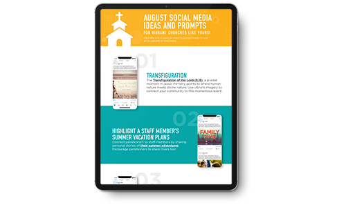
FREE Social Media Ideas
Social media offers a great way to communicate with your parishioners. Not sure what to post? Here are ideas to flesh out your month!
In This Issue
August 2022
FEATURED ARTICLES
- Does Anyone Read Printed Materials Anymore?
- Editor Feature
- Tips for Printing in Color: CMYK vs. RGB
- Graphics that GRAB: Designers Talk Cover Art
- Parish Dispatch
ALSO FROM LPi
More resources
- DIGITAL CATHOLIC ART & CONTENT FOR EVERY WEEK
With WeCreate, you’ll find the latest in stock photography, church clip art, Catholic prayers, weekly Gospel reflections, and more to make your communications engaging and vibrant.
Learn more - HOW TO TAKE MASS ATTENDANCE IN A PANDEMIC
Discover how the Archdiocese of St. Louis showed that just because church doors were closed, didn’t necessarily mean the faith community was inaccessible.
Click here to learn more. - THE STEWARDSHIP OF THE GOOD SAMARITAN
”Are you and I required to respond to the daily call of Jesus Christ? No. True stewardship requires nothing of us because true stewardship is all about giving of oneself freely. ”
Click here to read more.