
COMMUNICATING THE GOOD NEWS
In This Issue
October 2023
FEATURED ARTICLES
- One Church, Three Logo Options, Three Stories
- Announcing New WeCreate Content
- Divine Designs: Successful Church Logos Our Designers Loved Making and Why
- The Power of a Tagline — Strengthening Your Church's Mission and Identity
AT-A-GLANCE

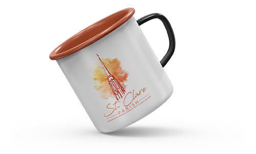
One Church, Three Logo Options, Three Stories
Our multimedia design team tackles branding projects for parishes all over the country and this week we are sharing an inside look into the creative process behind the design of a new parish logo.
When a church begins the process for a new logo or a brand refresh, our team meets with them to discuss their hopes and desires for their new design. Parish staff also fill out a branding questionnaire that helps prompt them with ideas about what they might want to include. Once this information gathering stage is complete, our designers each work on an individual logo as an option for the parish then present these options to parish staff. Here we share three of the initial logo options our team created for St. Clare of Assisi parish in Canyon Country, California alongside comments about each design from the artist who created it. We will also share the final design!
Logo Idea 1: Designed by Erich

How did your design satisfy the customer’s ideas?
Within the branding questionnaire, the customer requested to see a logo option that included a rendering of St. Clare. I chose to pursue this request because the church described itself as welcoming and friendly. People can more easily identify with a person, which can help to create a welcoming and friendly atmosphere.
What were some of the design decisions you made?
The most important aspect of rendering a figure is expression. For St. Clare, I searched through many reference images, trying to find the one that had the best expression that would fit into the parish atmosphere: welcoming and friendly. The figure I chose for St. Clare was one of softness and calm — all of which reinforce the welcoming and friendly spirit of the community.
As for the typeface, I wanted to use something bold but also something that had some thick/thin contrast to the strokes of the letters in order to complement the line variation within the rendering. It was also important for the typeface to have a little personality since the main icon of the logo focuses so much on communicating that.
What did you personally like about your design?
The face of St. Clare was key to the success of the logo. The face has a minimal amount of detail yet still captures the soft and calming expression of St. Clare. When portraying an illustrated figure, the face is everything. It's what helps a person identify with and care about another person. Another important aspect of the logo is its visual flow, encouraging continual engagement. As people often look at a face first, the logo features St. Clare's eyes pointing down, leading the viewer's eye down to the pyx, which then leads to the left arm of St. Clare which is gently pointing down to the name of the church. As the viewer's eye gets to the end of reading the text, the pop of green and the contour of the background shape leads the eye back to the top of the logo and back to St. Clare's face and eyes, beginning the process over again.
Logo Idea 2: Designed by Tim

How did your design satisfy the customer’s ideas?
The customer requested that the focal point of the logo be the San Damiano Cross. Other elements they mentioned were rue herbs and lilies.
What were some of the design decisions you made?
Working with this specific cross can be tricky because of its very distinct, recognizable shape and all of the harsh geometric corners it has. I chose to pair the cross with the rue and, to do that, I had to match the design style of both elements. The challenge for me was finding a way to make the cross feel “softer” but still look like the staple San Damiano Cross. That’s how the design took shape — I merged the rue stems with the cross and made sure to keep the same line-work throughout. I also decided to go with a softer color pallet to pair with the soft edges.
What did you personally like about your design?
I liked that I found a new, unique way to display the San Damiano cross outside of the traditional way that most people see or experience it.
Logo Idea 3: Designed by Kristen

How did your design satisfy the customer’s ideas?
St. Claire of Assisi had a couple of different suggestions for what they were hoping for with their new logo and identity. The element I wanted to capture was the use of a monstrance in an illustrative style design. Illustrative logos, I think, can capture different elements like the tone and the message you want to communicate in the design. With illustrative logos, there is more freedom with design and less rules when it comes to the creation of the logo.
What were some of the design decisions you made?
The church had wanted the design to be fresh, clean, and for the colors to be unique. As far as the colors go, we don’t usually receive requests like theirs for warm browns with a pop of green. I think these colors stand out from other Churches that more frequently request blues. Blue is a nice color to use but it is a color that everyone is comfortable with — it’s safe.
What did you personally like about your design?
I love the presentation of this logo because the roots of the design are traditional, with a serif font and the symmetry of the logo, but it has contemporary elements when it comes to the color, and a serif font paired with a sanserif font for the words “of” and “Catholic Church.”
The Final Logo
So, which of the three logo options did the staff of St. Clare decide to go with and develop into their final branding? In this case, the parish actually decided to incorporate elements of all three designs into their final brand! They wanted to incorporate the color pallet from Erich’s design, the monstrance theme from Kristen’s design, and combined it all with the San Damiano Cross from Tim’s design. Our designers got to work and it’s safe to say that everyone is proud of the final result. The logo below is what St. Clare of Assisi decided on!
Like what you see? There are number of other samples of church logos we’ve designed on our website. If your parish is ready for a logo refresh or a complete rebranding, you can learn more and get the process started with this brochure.

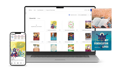
Announcing New WeCreate Content
One of the requests we frequently get for WeCreate content is art that appeals to children! This October, the Month of the Rosary, we are proud to announce the addition of a new collection of graphics designed specifically to honor Mary through telling the story of Our Lady of Fátima. The pieces, designed by one of our awesome multimedia designers, Heidi, focus on telling the story of the young Francisco, Jacinta, and Lucia and their encounter with Our Lady. These pieces can be used as educational content for faith formation programs or as graphics inside bulletins, social media, or on your parish website!

SOCIAL MEDIA INFOGRAPHIC
This month, learn ways to encourage your parish through social media. Pray the Rosary together, share inspiring ministries, bless your pets, and warm the season up with some Catholic humor!

Divine Designs: Successful Church Logos Our Designers Loved Making and Why
One of our favorite tasks to work on here at LPi is creating church logos and brandings! Whether a parish is simply updating their old logo or diving into a completely new design, our team of designers is there to guide them until their new brand is perfect. This week, we had an opportunity to interview a few of our designers about the logos they’ve created for parishes that they consider to be their favorite designs. Before we reveal these strong church logo designs and why each logo is so successful though, let’s quickly review what makes a strong parish logo.
According to our LPi multimedia design team, a strong, memorable, and well-made church logo should include:
- A good composition that can be recognized at a large or small scale. It should be easily read and recognized from far away and up-close.
- Strong brand-recognition. If there’s another church down the road with a very similar logo, it can cause confusion to the community and for parishioners.
- Colors that represent the “feel” and “atmosphere” of the church, so if the church is more traditional or more modern, the style of the logo and the colors used should be a direct representation of that.
- A timeless design. Choosing a logo that is too “trendy” can be an issue when, a few years down the road, it may end up looking off-trend or outdated.
- Intentional design elements. Choosing a logo that is too complicated or includes too many elements can also make it hard to read and remember.
Now, on to the logos that our designers chose to highlight! Three members of our design team chose a logo that they created and kindly answered a few questions about why that particular logo is a strong design.
Heidi’s Choice:

What, in your opinion, makes this a strong logo?
This particular logo is strong for a few reasons. One is because it’s fully customized. You’re very unlikely to see another logo that is similar in the same region that Our Lady Queen of Peace is in or even beyond. Because of this, the logo is also more likely to be memorable and helps to create brand recognition and loyalty for the parish. Another thing that makes it a strong logo is that its design is simplistic enough that it can be easily understood at a distance.
What were some of the hopes and goals of the church going into this design and how did the design satisfy those goals?
The parish wanted to use Marian imagery and the University’s colors in their design. Their idea was that this would help tie their two church communities and their educational campus together. They also wanted to represent peace with a dove and/or olive branch. We were able to include all of these requests in the final design!
What do you personally like about this logo?
I like how when a viewer looks at the logo from far away, they immediately see a dove but when they look at it up-close, they see more — Mary, the crown, and the olive branch. This makes the logo unique and interesting. I also love the soft, calming color palette that matches well with the subject.
Evan’s Choice:

What, in your opinion, makes this a strong logo?
This is a strong logo because of its unique use of negative space, and the fact that the primary text is integrated into the logo. It incorporates a water element which balances out the upper portion that features the architecture of the church. The two shades of blue are contrasted with a fresh green which together creates an engaging pallet, and an engaging feel for the parish.
What were some of the hopes and goals of the church going into this design and how did the design satisfy those goals?
The folks at San Juan Del Rio wanted to incorporate a river into the logo, so I included that in the design. The parish also wanted their logo to feel welcoming. One of the most welcoming colors psychologically is green, so I went with a friendly green that balanced out the blue hues.
What do you personally like about this logo?
When working on this logo I also wanted all of the line work inside the image to create movement throughout the logo. I also enjoy the modern colors. They are unique and I think they create a sense of excitement!
Gaby’s Choice:

What, in your opinion, makes this a strong logo?
I think the overall simplicity of the logo is what makes it so strong! It can be difficult for a designer to illustrate a religious figure, especially the saints. We often get paintings or stained-glass images as references that are complex and busy. We have to make sure to capture their likeness in our design as well as include any small details that are often associated with that figure and that can be challenging. For example, they might be seen with a flower, or a certain type of crucifix, and those elements can sometimes be hard to pull off at such a small scale. For reason, I think that this logo was a success — not only because is it recognizable as the figure, but it is so simple and iconic that a viewer is able to point out what each element is and the purpose each serves for the whole design!
What were some of the hopes and goals of the church going into this design and how did the design satisfy those goals?
For this branding, the customer specifically requested that the logo be done in an illustrative style of design. They wanted the logo to include the figure Our Lady of LaSalette as well as the hammer and pincers associated with the crucifixion of Jesus on the cross. I satisfied their wishes by having the sole focus of the logo be a zoomed-in version of Our Lady of LaSalette’s face. By taking an up-close approach to the design, I was able to fit in all the details that make her recognizable: her crown with roses, the single tear running down her face, and her crucifix that she wears around her neck with the hammer and pincers. None of this could’ve been achieved if I would have tried to illustrate her whole body.
What do you personally like about this logo?
I think this logo is one of my strongest so far. Fun fact about this one — I had originally started with a completely different design, hated it, asked a fellow coworker for some advice, then started over from scratch. My favorite thing about this logo was the process. Seeing where it started to where it ended up was very rewarding for me! Especially since I don’t consider this illustrative style my strongest, I decided to take this challenge head-on. Typically, iconic logos are my favorite to design, so it was fun combining the illustrative and iconic styles into one piece. I also chose specifically to only use one color for this logo to push the simplicity even further and I am very pleased with how it turned out!
Like what you see? There are number of other samples of church logos we’ve designed on our website. If your parish is ready for a logo refresh or a complete rebranding, you can learn more and get the process started with this brochure.

The Power of a Tagline — Strengthening Your Church's Mission and Identity
We live in a fast-paced world. Attention spans are shrinking and competition for people's time is fierce. To keep up, having a strong and memorable brand identity for your Catholic church is essential. One crucial element of a strong brand identity is a well-crafted tagline — a short and impactful phrase that encapsulates the essence of your church's mission and values. Let’s explore the importance of a tagline, its potential to further your church's mission, and practical ideas for creating and integrating your tagline into your parish communications.
Understanding the Power of a Tagline
A tagline is a concise and memorable phrase, often placed alongside your church's name or logo, that communicates the essence of your mission and values. It serves as a quick snapshot of what your church stands for, leaving a lasting impression on both current and potential members. A well-crafted tagline has the power to evoke emotions, connect with your target audience, and reinforce your church's identity.
Advancing Your Church's Mission with a Tagline
A compelling tagline can be a powerful tool in advancing your church's mission. It helps your parish community to establish a clear identity, making it easier for people to understand what you are about and what sets you apart from other parishes. A tagline can convey your core values. For example:
- Faith, Love, and Community
- Growing Together in God's Grace
- Everyone is Welcome Here
- Gather in God’s Name, Grow in God’s Time, and Go in God’s Spirit
- God’s Faithful Community
- Walking Together with Christ
- Stewardship Community
By communicating these values, you create a sense of belonging and attract like-minded individuals to join your faith community.
Additionally, a tagline can aid in building recognition and recall for your church. When consistently used across various communications, it becomes synonymous with your church's name and logo. This familiarity can foster trust and strengthens your overall brand, making it easier for people to connect and engage with your community.
Crafting a Meaningful Tagline
Coming up with the perfect tagline may seem daunting, but it's a creative process that involves understanding your church's unique attributes and the needs of your congregation. Here are some ideas to help you get started:
- Seek input from the whole church staff, parishioners, and other leadership. Gather ideas and insights from those who know the church best to ensure the tagline accurately reflects its mission.
- Focus on your church's mission and values. Consider what makes your church stand out and the impact you wish to make in the lives of your members and the greater community.
- Keep it simple and memorable. Aim for a concise and easy-to-remember tagline that can be quickly recalled by those who hear or see it.
Integrating Your Tagline into Parish Communications
Once you've crafted a compelling tagline, it's time to integrate it into your parish communications to strengthen your church's identity consistently. Don’t forget to:
- Place it prominently on your website and social media profiles. Make sure it's visible in headers, bios, and cover images to increase brand recognition.
- Include it in all of your printed materials. Feature your tagline on church bulletins, banners, flyers, letterhead, and newsletters to reinforce your message.
- Use it in videos, teachings, retreats, homilies, and more. Remember to use your tagline in any videos and other multimedia presentations your parish might use in order to underscore your church's values and mission.
A well-crafted tagline has the potential to become the heart of your church's brand identity. By succinctly expressing your mission and values, it enhances recognition, fosters emotional connections, and attracts like-minded individuals to your faith community. Take the time to brainstorm and create a tagline that resonates with your church and aligns with your mission and incorporate it consistently across all parish communications to build a strong and enduring brand presence.
Need help with your parish’s overall brand identity? Learn more about how LPi can help guide your parish through a logo refresh or an over-all brand makeover!

Church Communications Expert Spills All
We are so honored to partner with vibrant parishes across the United States, each one working to bring the kingdom of God to their communities in unique ways. At St. Margaret of York in Loveland, Ohio, Michelle Manczyk serves as the parish communications coordinator. One of her many responsibilities is to design their parish bulletin. We sat down with her this week to learn more about her experience working with church bulletin design, gather some tips and tricks, and hear about the resources she uses to create such a beautiful weekly bulletin.
Q. Hi Michelle, your parish’s bulletin is awesome! How long have you been designing it?
A. Thanks! I’ve been working for St. Margaret as communications coordinator for over 6 years now! When I first started this job, the bulletin design was a little rough, so I’ve been slowly updating and developing it over time. The current iteration launched in 2021 although I’m always working to improve it. I had a unique opportunity when I started this position at St. Margaret because we were switching from our old bulletin company to using LPi for our bulletins, so I took advantage of that transfer to build something new.
Q. What are your goals for the bulletin?
A. My vision is that our bulletin should be a vehicle for catechesis and faith formation instead of a glorified repeat of the parish calendar. Now, the calendar is important so we do include the larger calendar items, but the rest can be found on our website. This makes a lot of room in the bulletin for other content.
Q. Speaking of content, where do you find inspiration?
A. I definitely use content from WeCreate a lot. It saves me time because, with WeCreate, I don’t have to come up with a cover design by myself every week and I like to use a lot of the square graphics available. I find that even the social media graphics in WeCreate can be perfect options to fill blank space in the bulletin. My parish and I also really love the Father Flood comics in WeCreate. They’re so much fun! We put a Father Flood comic into every bulletin and my husband always flips right to the comic to start with before he reads the rest of it. Those little clips are a fantastic way to get people excited about the publication.
Q. What kind of feedback have you heard?
A. The majority of the feedback for the new direction for the bulletin has been overwhelmingly positive. Our parish is in a suburb of Cincinnati, so we have a lot of parishioners who work for big companies downtown. At these companies, employees are exposed to a polished, professional look for print publications, so it’s important to us that they can tell we’ve taken extra care to make sure the church bulletin design looks great.
Q. What is your favorite aspect of creating the bulletin every week?
A. The design layout and typography part of it are my favorite things to work on. When I first started working at St. Margaret, all we had when it came to church branding was a logo and nothing else. Over time I’ve enhanced the brand for our parish with design elements unique to us. I’ve gathered lots of inspiration from the church architecture. For example, there’s a design carved into the altar that I used to inspire a ribbon that can be found in the bulletin design. Another example of this is down by the numbers on each page of the bulletin there is a red box with a little circle. These corollate with a design element found on the outside of our parish buildings. Using the church architecture as inspiration has enriched our visual identity.
Q. What tools help you get the job done?
A. I use WeCreate a lot and I also use Adobe Creative Suite programs. We also make use of the Parishes Online bulletin website widget to keep the bulletin automatically updated on our parish website every week. We include links to the digital bulletin in many of our emails and parish communications directing people to view that week’s bulletin online in case they missed picking one up at church.
Q. Lastly, what tips do you have for other editors?
A. Don’t forget to give yourself time to look at your bulletin with fresh eyes. It’s good to build it one day, sleep on it, then come back to it the next day or even a couple days later to make sure there aren’t any mistakes you’ve missed. Also, don’t forget to have a proofreader!
Thank you, Michelle, for sharing your parish and expertise with us!
If you have a vibrant parish and would like to be featured in an upcoming Parish Dispatch or know where we can find a great church bulletin in your city, let us know!
ALSO FROM LPi
Branding Matters
A good brand invites parishioners and seekers into the mission of your church, helping everyone to grow in faith, live in hope, and reach out in the love of Jesus Christ.

Time for a New Website?
WeConnect is your superpower to create simple, unique websites — in minutes. Sign up for a free demo!
Free Art & Content
Parishes that publish with us receive free access to WeCreate, our digital library of faith-filled graphics, reflections, and more to use any way they want!

Join Our Team!
We're hiring across the U.S.A.
Listen to real people tell real stories about their experience working for LPi.
In This Issue
October 2023
FEATURED ARTICLES
- One Church, Three Logo Options, Three Stories
- Announcing New WeCreate Content
- Social Media Ideas
- Divine Designs: Successful Church Logos Our Designers Loved Making and Why
- The Power of a Tagline — Strengthening Your Church's Mission and Identity
ALSO FROM LPi
More resources
- DIGITAL CATHOLIC ART & CONTENT FOR EVERY WEEK
With WeCreate, you’ll find the latest in stock photography, church clip art, Catholic prayers, weekly Gospel reflections, and more to make your communications engaging and vibrant.
Learn more - HOW TO TAKE MASS ATTENDANCE IN A PANDEMIC
Discover how the Archdiocese of St. Louis showed that just because church doors were closed, didn’t necessarily mean the faith community was inaccessible.
Click here to learn more. - THE STEWARDSHIP OF THE GOOD SAMARITAN
”Are you and I required to respond to the daily call of Jesus Christ? No. True stewardship requires nothing of us because true stewardship is all about giving of oneself freely. ”
Click here to read more.