
COMMUNICATING THE GOOD NEWS
In This Issue
August 2023
FEATURED ARTICLES
- Church Websites Our Design Team Loves — Peep for Inspiration!
- The Power of Color: Enhancing Web Design for Your Parish
- The Ultimate Website Checklist for Parishes with Schools
- n/a
AT-A-GLANCE
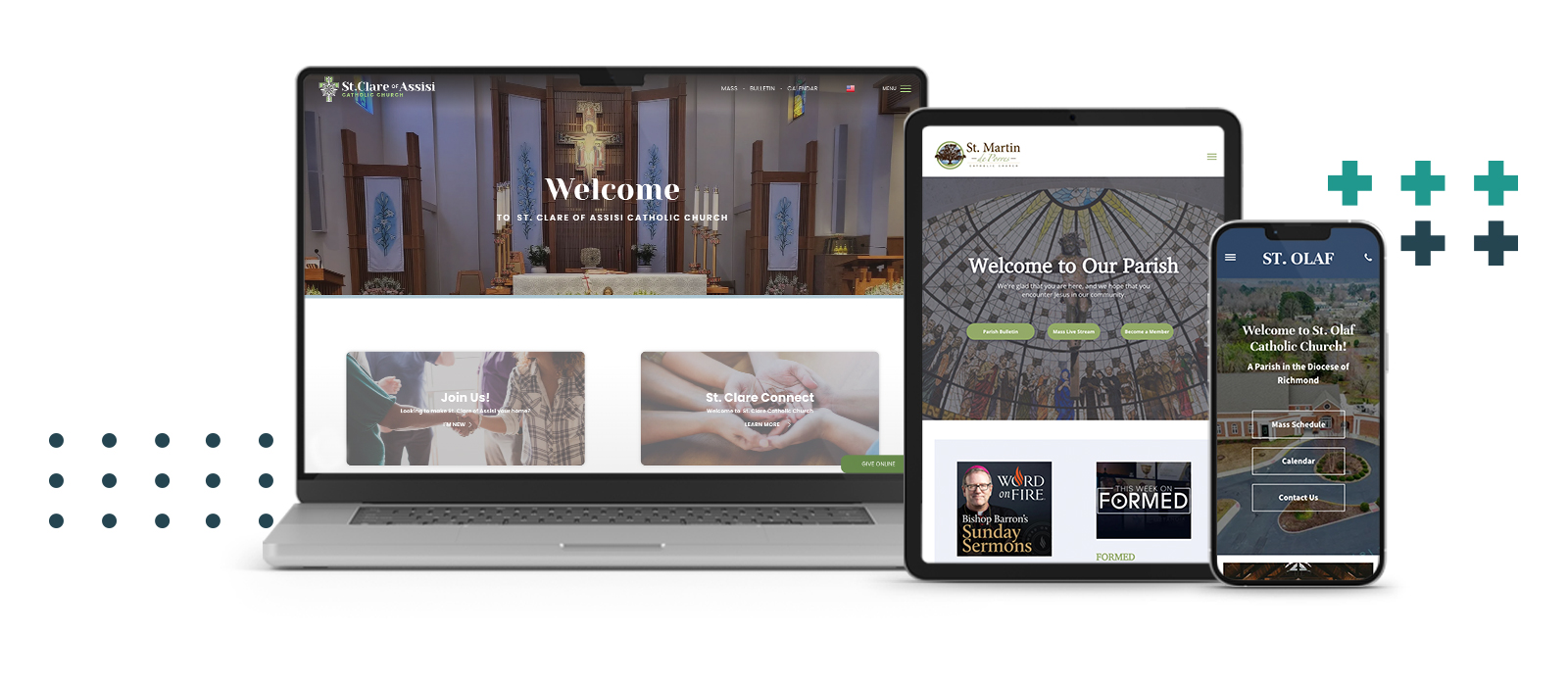
Church Websites Our Design Team Loves — Peep for Inspiration!
Your parish website matters! It’s a direct extension of your culture, your message, and your mission. Our design team has worked with parishes across the nation to build websites for church communities from scratch and complete website redesigns that run the gambit from elaborate to small tweaks. Our website builder, WeConnect, makes it easy for parish staff to create and maintain amazing church websites and we love being a part of the process. This week we picked three sites to show off. We hope you find some inspiration for your own parish’s website in the following designs.
Website 1 -
St. Clare of Assisi

(Click the image to visit the sample site.)
What we love about it:
• We love the vibrant color pops throughout. The pairing of green, pale blue, and brown isn't a color combination that we normally see, and it works beautifully here.
•There is lovely photography throughout the site giving it a more professional and polished look while still being completely personal to the church and inviting to visitors.
• The use of a serif (more decorative) font paired with a sans serif font, ties the new logo and branding seamlessly into the site while making everything super legible and elegant at the same time.
• The subtle but extremely effective usage of animations while scrolling.
• We love how everything about this site is super bold and clean. The use of large bold typography adds to the design, specifically utilizing black type to ensure the legibility of the homepage.
Website 2 -
St. Martin de Porres

(Click the image to visit the sample site.)
What we love about it:
• This is a nice example of how clean sidebar navigation can be useful for a church website, especially since it never disappears when scrolling. This means it’s always accessible to those visiting the website.
• This design is a great example of how sometimes "less is more." There isn't a ton of content crowding the homepage which is part of the reason it is a very successful design.
• The space in this site is filled without feeling overwhelming. There is no excess or unnecessary space.
• This site’s navigation is organized well. For example, it’s easy to access the Mass times, the digitized weekly bulletin, the parish’s livestreaming links, and information on how to become a member.
• The site does a good job of mixing two different typefaces. These are used in consistent sections to maintain readability across whole site.
Website 3 -
St. Olaf

(Click the image to visit the sample site.)
What we love about it:
• We love the contrasting and consistent color palette for emphasizing important information and links.
• There is no unnecessary filler space or information. Everything on the subpages is concise and relevant to the page topic.
• The pages are balanced with positive and negative space. There is enough breathing room so that information doesn't get jumbled and smashed together but there’s also not too much spacing — something that can cause the information to feel minimal or disconnected. The balance is on point.
• There is the perfect amount photography used throughout the site to break up text information with inviting images of the community.
• This site incorporates smart choices when it comes to the color combinations — especially introducing tints of the main colors in the palette really gives the site the proper hierarchy it needs to guide the audience through each of the pages.
• This site is a great example of utilizing a clean typography pairing when the church doesn’t have a specific logo yet.
• A simple and organized footer gives the homepage a clear end.
Like what you see? Feel inspired? If your parish needs help dialing in your web presence or simply wants a brand-new look, our web design team is the best of the best! Or simply start small with a new or refreshed parish logo to give your community the identity it deserves!
Which parish website do you like best?
Take a look at a few parish websites we’ve created using WeConnect. We love them all and want to hear from you! Like and share your favorites on Facebook.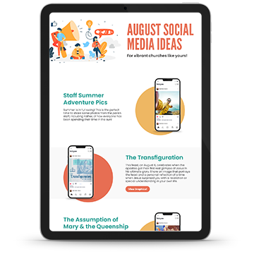
SOCIAL MEDIA INFOGRAPHIC
Back-to-school ideas, faith formation registration, the Transfiguration, Marian posts, and more all appear in our social media ideas for August.

The Power of Color: Enhancing Web Design for Your Parish
In the realm of web design, color choices play a pivotal role in capturing the attention and engaging the emotions of visitors. This importance is further amplified when it comes to designing websites for religious institutions. By carefully selecting a color palette and understanding some of the basic principles of color theory, church staff can create a visually appealing and spiritually enriching online presence that resonates with their community on a deeper level.
"Color is a power that directly influences the soul."
- Artist and designer, Wassily Kandinsky
A Primer on Color Theory:
Color theory forms part of the foundation of effective design and its principles are crucial in creating a harmonious visual experience. The color wheel, for instance, presents a spectrum of hues that can be used to evoke specific emotions and set the tone for a parish’s website. Warm colors, like reds and oranges, convey a sense of energy and passion, while cool colors such as blues and greens express calmness and serenity.
As far as the numbers of colors to choose or highlight, the human mind tends to enjoy viewing two or three colors max. Having more colors than that can cause a person to feel anxious or overwhelmed and subconsciously chose to navigate away from your website faster than you’d like. Fun fact — this is why, when fast food restaurants first became popular, they would use a color pallet inside their restaurants with a ton of contrasting colors. The idea was that they want people to get their food and move on to make room for more customers, so they intentionally chose to have a crowded color pallet to inspire people to eat and go. This is exactly the opposite of what you want your parish website to inspire, so, stick to about three colors to encourage people to stick around a bit.
That’s Great But, How Do We Choose?
Choosing your website colors is important but all of this can feel overwhelming. Here are three simple items to consider when deciding which colors to use on your parish’s website.
- Symbolism and Tradition: In Catholicism, colors hold significant symbolism, especially when it comes to the Liturgy. For example, white is associated with purity, innocence, and the Resurrection; red signifies sacrifice and the Holy Spirit; and purple represents penance and preparation. Incorporating these traditional colors into the web design can help communicate the church's core values and beliefs.
- Emotional Connection: Color has a profound impact on emotions. By selecting colors that align with the intended emotional response, church staff can create a welcoming and comforting digital environment. For instance, earth tones like browns and greens evoke a sense of grounding and stability, fostering a connection to nature and God's creation.
- Consistency and Branding: Consistency across different communication channels, including your website, enhances recognition and brand identity for your parish. Choosing a consistent color palette that aligns with the church's physical space, mission, or charism, reinforces a unified message and helps build a recognizable online presence for your community. Don’t have an intentional brand yet with colors and a logo? LPi can help you get the process started!
Avoiding Common Color Mistakes:
While color choices can enhance a church's web design, some considerations should be kept in mind to avoid potential pitfalls. Firstly, an overwhelming use of bright or neon colors can create a jarring experience, distracting visitors from the content and message. Secondly, colors that clash or lack contrast may lead to readability issues, hindering your viewer’s ability to engage with the website's information effectively.
The importance of choosing an intentional color pallet for your website and overall branding cannot be overstated. Remember, your goal is to give visitors to your website a visually appealing, emotionally engaging, and spiritually enriching online experience. By harnessing the power of color, your website can become a virtual sanctuary, inviting visitors to explore and deepen their connection with their faith and community. For more inspiration, we collected three parish websites that we think are using color well.
Need help creating an incredible website for your parish? Our design team works with churches across the country to get their websites and brands dialed-in.

The Ultimate Website Checklist for Parishes with Schools
Is there a school connected to your parish? If so, you understand the unique challenges that come with coordinating a parish and a school web presence simultaneously. We put together an essentials checklist to help you stay on top of it all, including some links to tools that will save you time and energy.
1. Don’t try to fit two sites into one.
Although the parish and the school are ministries of the same church community, it is much more user-friendly to have a separate website for each. The sites can have links to easily navigate to each other, but there is too much content for both your church and school to squeeze onto one website. Many successful parish/school combos have used a landing page for their combined web presence that offers visitors an option to visit the parish website or the school website. This is a great option because it showcases both to every visitor you have, but keeps the information packaged in more tidy way.

St. Joseph makes use of the single landing page option and points to both their school and church website from their main site.
2. Coordinate your websites with some familiar styles, colors, and features.
Your parish and school branding should have some elements in common. Granted, the logo for each may be different but, using similar colors and/or fonts between the two websites goes a long way toward creating unity between the different ministries. Having an intentionally created master brand book or brand guidelines that both the school and the church use is a super useful tool to keep all of your parish, school, and church communications looking professional and recognizable.
3. Use the same organizational system on both sites.
This way, people who must navigate between both sites already know where to look on each homepage for a main menu, contact information, a calendar, and more. Keeping the sites organized in a similar way will also make it easier for those updating and maintaining the sites to keep everything organized. The sites might have different information plugged into each navigational system but keeping everything in generally the same place contributes to maintaining a consistency to your community’s brand identity.
4. Make sure staff contact information is accessible on both sites.
People may accidently end up on your parish contact page looking for a way to reach the school and vice-versa. You can save your staff some time directing calls to the opposite office by including basic contact information for the school on the church’s contact page and for the church on the school’s.
5. Keep the sites updated.
We know, we know, it should go without saying but, it never hurts to have a reminder. Keeping event information, any office hours, and staff member changes up to date goes a long way toward keeping your church and school’s online presence friendly and convenient to those visiting it.
6. Use vibrant and engaging imagery.
You’ve spent all of this time following the above steps to make your church and school websites as professional as possible so don’t be tempted to skimp on beautiful imagery to compliment your content. Here are a few time-saving tools to be sure your website graphics are as vibrant as your church and school communities.
- WeCreate — You can save a ton of time by using a tool like WeCreate that already has parish and school graphics and stock photography created for you, ready to be used however you desire. You could also use our guide to parish photography to lift up the gifts of the photographers in your midst.
- The Parishes Online bulletin widget — If your parish is an LPi partner, you already have access to a widget that will automatically publish your current bulletin to your website.
- Automatically updated sections — WeConnect, our web builder for parishes and schools, comes with pre-built sections featuring weekly content like the saint of the week, and Gospel verse and illustration, which update automatically. Get new professionally curated content published to your sites weekly without lifting a finger!
We sincerely hope this parish and school website checklist helps you build the perfect web presence for your community.
If you get stuck, or simply want someone else to do the designing for you, check out some of the before and after images of sites that our designers have created. Let’s work together to make your parish and school website dreams come true!

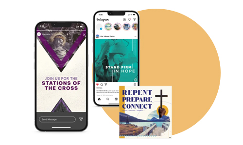
Using the Facebook and Instagram STORIES Tool for Engagement
An awesome tool that both Facebook and Instagram have developed over the last few years is their STORY feature. This tool is so robust and a great (free!) way to engage with your community when used correctly. In this blog you will find some tips and tricks on how to utilize the social media story feature to share your own vibrant parish community with the world!
Stories? Why should I have to learn ONE MORE THING?
Social media is an extension of the wonderful community that your church has already built and, simply put, the way that the majority of your parishioners are communicating with each other in their daily lives. Did you know that 82% of people in the United States use Facebook to communicate with each other on a daily basis? Since this is the case, churches should consider using all of the tools that Facebook and other social media platforms offer in order to connect daily with their community and keep their community connected!
The story feature on Facebook and Instagram is designed specifically to encourage your following to message you and engage with each story post you make. Story posts expire after 24 hours and are usually quick and sweet while also incorporating easy to use tools for engagement. For this reason, using the stories feature makes it easier for you to engage with your followers on a daily basis! Stories are also a quick and easy way for you to collaborate with followers and repost their content — another tool you can use to engage with your community and lift up your parishioners!
So, What Exactly ARE Social Media Stories?
On Facebook and Instagram, a story is a post you can make that consists of either a photo or a short video. These posts work like a slide show and offer a new photo or video after a few seconds. Story posts show up in your STORIES FEED instead of on your regular ol’ newsfeed. Stories expire in 24 hours, so this feed is constantly refreshing. This is appealing to your users because they know that they should look at your stories if they want to find quick, current content from you. This attraction is evident in the fact that most posts using the stories feature get many times more views and interactions than newsfeed posts do. This is due to the allure of quick, current content, as well as the fact that Facebook provides more access points for users to view your stories than it does to your permanent newsfeed.
Why does Facebook prefer to promote story posts over regular newsfeed posts? In part it’s because story posts have a bunch of options for INTERACTIVE features that you can add to your photo or video which keep people using the app for longer amounts of time. These features are how you can direct more engagement with stories, and Facebook is ALL ABOUT getting as much engagement as possible.
Engagement tools you can add to story posts:
- Captions for accessibility for all users!
- viewer polls
- donation buttons
- question and answer prompts
- quizzes
- products to buy
- links
- music
- Countdowns
- Food orders
- Small business support shout outs
- mentions & tags
All responses to a story post will go to the app’s messaging feature as a direct message to you instead of being posted as a comment or a “like” as is standard on newsfeed posts. You can then message the user who interacted with your story, “like” whatever they sent via messenger, or use the engagement data collected from that story post. For example, if you are doing a poll and you get poll results, you could put those results in a new story post for even more engagement! Engagement, engagement, engagement!
What Kind of Content Should I Be Posting in Stories?
It’s this author’s opinion that all regular newsfeed posts should also be mirrored in your stories as story posts. Remember, more eyes are usually on stories than on newsfeed posts so one way to draw attention to a new newsfeed post is to also post it as a story!
Need help getting started? You’re in luck! In WeCreate, LPi’s digital library of ready-to-use content made specifically for you, there’s an entire selectin of images created specifically to be used in social media stories.
In WeCreate, these images can all be found under the section titled "Social Media Stories.” If you click that section and then use the search bar, the words you search will only turn up results that are sized and designed specifically to be used as Facebook and/or Instagram stories. Often these images are grouped in WeCreate with other images that are visually similar to them so that you can use them, one after the other, for multiple story slides! Basically, we made it really easy for you to just take our ready-made images and create in-depth stories for your church in the blink of an eye! You can simply save them from WeCreate and then drop them into whatever platform you are using — or if you are feeling fancy, you can overlay one of the special engagement tools (mentioned earlier in this blog) onto them.
Remember that for maximum viewership, it’s important to make sure that the privacy settings on your stories are set to public. This way, anyone who visits your church’s Facebook or Instagram can view them and interact with you!
The All-Important Story Highlight Menu
For Instagram users, your stories don’t actually have to have a 24-hour expiration date. To avoid this, make sure to build a library of your most important story posts by using Instagram’s Story Highlights tool. When you highlight a story, you are effectively building a catalogue of story content that you want to save permanently on your Instagram feed. You can separate these permanent story posts into categories of your choosing like news, milestones, staff introductions, polls, parishioner highlights, or whatever else you can come up with. This library of story content will show up as part of your Instagram profile and viewers will see these category options for story highlights before they even see your main newsfeed!
Conclusion — Tag us!
Want to connect with us? Tag LPi in your stories! Tagging another user in your story post makes it possible for that user to easily re-post your story into their own story feed! This is a great way to promote each other online by sharing content so, if you use our WeCreate story resources, feel free to tag us and maybe you will find your story reposted on our own social media accounts! On Facebook we are @LitPub and on Instagram we are @LPi_Community. See you in the social sphere!

Church Communications Expert Spills All
We are so honored to partner with vibrant parishes across the United States, each one working to bring the kingdom of God to their communities in unique ways. At St. Margaret of York in Loveland, Ohio, Michelle Manczyk serves as the parish communications coordinator. One of her many responsibilities is to design their parish bulletin. We sat down with her this week to learn more about her experience working with church bulletin design, gather some tips and tricks, and hear about the resources she uses to create such a beautiful weekly bulletin.
Q. Hi Michelle, your parish’s bulletin is awesome! How long have you been designing it?
A. Thanks! I’ve been working for St. Margaret as communications coordinator for over 6 years now! When I first started this job, the bulletin design was a little rough, so I’ve been slowly updating and developing it over time. The current iteration launched in 2021 although I’m always working to improve it. I had a unique opportunity when I started this position at St. Margaret because we were switching from our old bulletin company to using LPi for our bulletins, so I took advantage of that transfer to build something new.
Q. What are your goals for the bulletin?
A. My vision is that our bulletin should be a vehicle for catechesis and faith formation instead of a glorified repeat of the parish calendar. Now, the calendar is important so we do include the larger calendar items, but the rest can be found on our website. This makes a lot of room in the bulletin for other content.
Q. Speaking of content, where do you find inspiration?
A. I definitely use content from WeCreate a lot. It saves me time because, with WeCreate, I don’t have to come up with a cover design by myself every week and I like to use a lot of the square graphics available. I find that even the social media graphics in WeCreate can be perfect options to fill blank space in the bulletin. My parish and I also really love the Father Flood comics in WeCreate. They’re so much fun! We put a Father Flood comic into every bulletin and my husband always flips right to the comic to start with before he reads the rest of it. Those little clips are a fantastic way to get people excited about the publication.
Q. What kind of feedback have you heard?
A. The majority of the feedback for the new direction for the bulletin has been overwhelmingly positive. Our parish is in a suburb of Cincinnati, so we have a lot of parishioners who work for big companies downtown. At these companies, employees are exposed to a polished, professional look for print publications, so it’s important to us that they can tell we’ve taken extra care to make sure the church bulletin design looks great.
Q. What is your favorite aspect of creating the bulletin every week?
A. The design layout and typography part of it are my favorite things to work on. When I first started working at St. Margaret, all we had when it came to church branding was a logo and nothing else. Over time I’ve enhanced the brand for our parish with design elements unique to us. I’ve gathered lots of inspiration from the church architecture. For example, there’s a design carved into the altar that I used to inspire a ribbon that can be found in the bulletin design. Another example of this is down by the numbers on each page of the bulletin there is a red box with a little circle. These corollate with a design element found on the outside of our parish buildings. Using the church architecture as inspiration has enriched our visual identity.
Q. What tools help you get the job done?
A. I use WeCreate a lot and I also use Adobe Creative Suite programs. We also make use of the Parishes Online bulletin website widget to keep the bulletin automatically updated on our parish website every week. We include links to the digital bulletin in many of our emails and parish communications directing people to view that week’s bulletin online in case they missed picking one up at church.
Q. Lastly, what tips do you have for other editors?
A. Don’t forget to give yourself time to look at your bulletin with fresh eyes. It’s good to build it one day, sleep on it, then come back to it the next day or even a couple days later to make sure there aren’t any mistakes you’ve missed. Also, don’t forget to have a proofreader!
Thank you, Michelle, for sharing your parish and expertise with us!
If you have a vibrant parish and would like to be featured in an upcoming Parish Dispatch or know where we can find a great church bulletin in your city, let us know!
ALSO FROM LPi
Join Our Team!
We're hiring across the U.S.!
Listen to real people tell real stories about their experience working for LPi.

UNBOUND
Now and then, every pastor needs time away.
Refresh your spirit. Invite an Unbound priest for the weekend to serve your parishioners as they walk with the poor.
“Come to me, all you who labor … and I will give you rest.”
(Matt. 11:28)
Time for a New Website?
WeConnect is your superpower to create simple, unique websites — in minutes. Sign up for a free demo!
Faith Filled Art & Content
Fill your bulletin, website, and socials with ready-made Catholic art and articles that inspire with WeCreate!
In This Issue
August 2023
FEATURED ARTICLES
- Church Websites Our Design Team Loves — Peep for Inspiration!
- Social Media Ideas
- The Power of Color: Enhancing Web Design for Your Parish
- The Ultimate Website Checklist for Parishes with Schools
ALSO FROM LPi
More resources
- DIGITAL CATHOLIC ART & CONTENT FOR EVERY WEEK
With WeCreate, you’ll find the latest in stock photography, church clip art, Catholic prayers, weekly Gospel reflections, and more to make your communications engaging and vibrant.
Learn more - HOW TO TAKE MASS ATTENDANCE IN A PANDEMIC
Discover how the Archdiocese of St. Louis showed that just because church doors were closed, didn’t necessarily mean the faith community was inaccessible.
Click here to learn more. - THE STEWARDSHIP OF THE GOOD SAMARITAN
”Are you and I required to respond to the daily call of Jesus Christ? No. True stewardship requires nothing of us because true stewardship is all about giving of oneself freely. ”
Click here to read more.